Accessibility
Why Accessibility Matters
Accessible content ensures that everyone, including people with disabilities, can access and understand your materials.
- Improves usability for everyone
- Supports a wide range of needs
- Aligns with accessibility standards
- Leads to clearer communication
Text & Structure
Well-structured content helps all users scan and understand information quickly. Screen readers rely on headings and structure to navigate content efficiently.
- Use headings in a logical order (H1 > H2 > H3)
- Keep writing clear and concise
- Break up content into short paragraphs or lists, avoid large blocks of text
- Use real text when possible; not images of text
Accessible Links
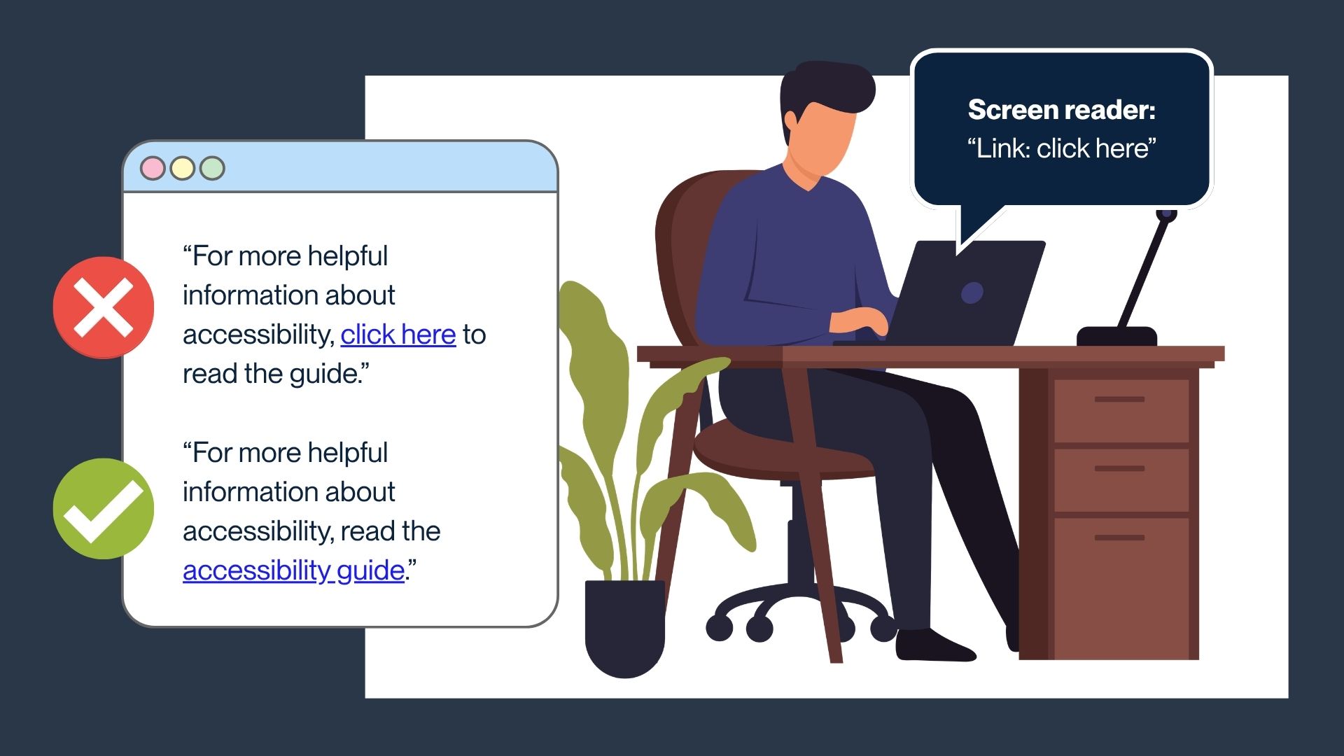
Screen readers announce links without surrounding context. Clear, descriptive link text helps users understand where a link will take them. This also helps anyone viewing the page to scan and quickly identify the links on the page.
Use descriptive link text and avoid phrases like “Click here”. Using “click here” as link text makes it unclear where the link goes.
For example: "Click here to read the guide" vs. "Accessibility Guide"
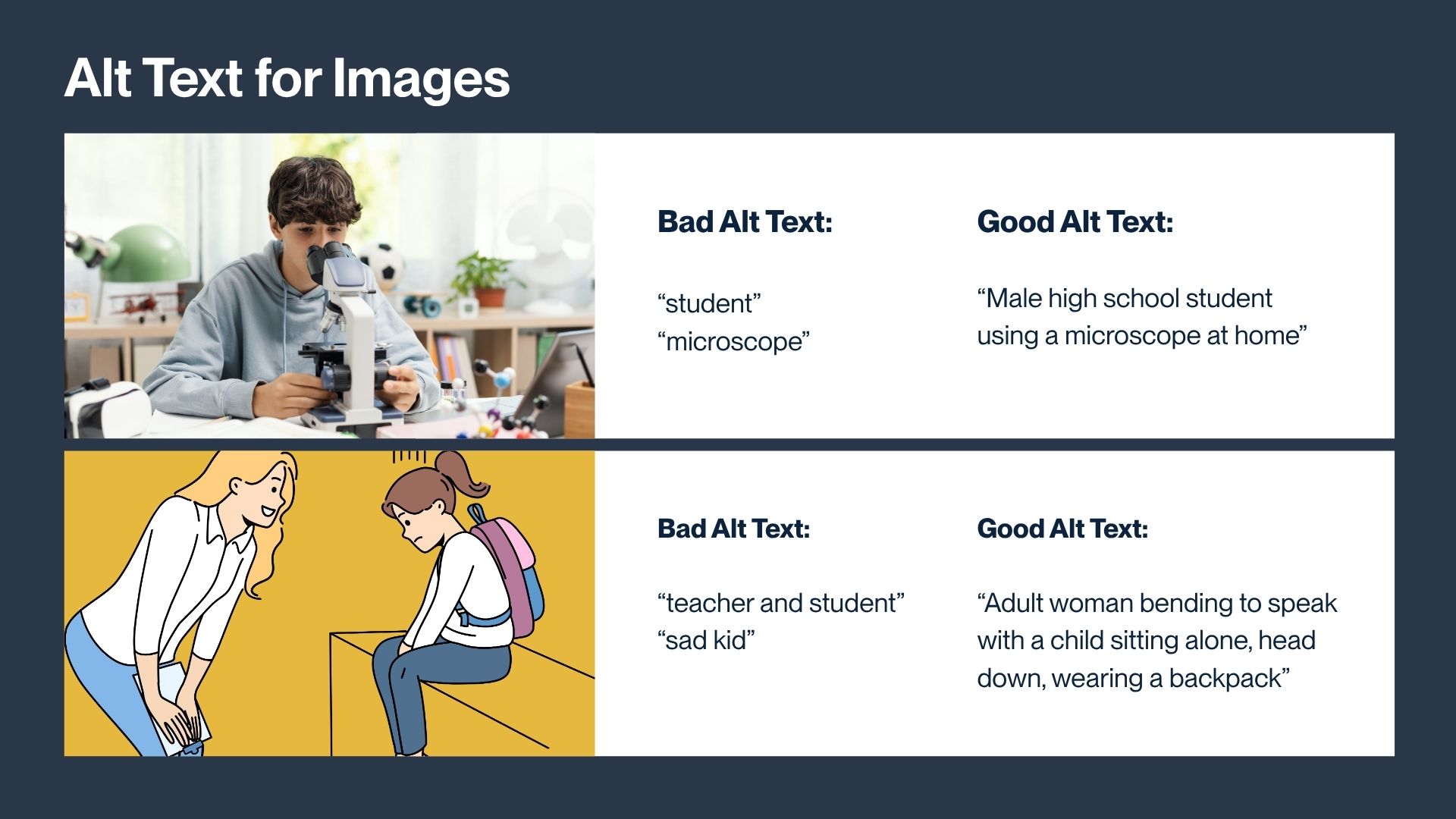
Accessible Images (Alt Text)
Alt text is a short description of an image for people who use screen readers. It should explain what someone needs to understand if they can’t see the image.
When to use alt text:
- If the image adds meaning → write alt text
- If the image is decorative (like a divider) → leave alt text blank
How to write good alt text:
- Focus on the important information
- Keep the alt text concise
- Don’t start with “image of”
Keep in mind that when adding alt text to digital Canva-based projects, Canva has an alt-text character limit (250 characters).
Color & Contrast
Not all users perceive color the same way; including those with color blindness/color vision deficiency. Strong contrast and clear labeling help ensure content is readable and understandable for everyone.
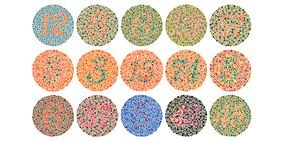
- Ensure strong contrast between text and background (for example, avoid light gray text on white)
- Do not rely on color alone to communicate meaning (use labels, patterns, or icons)